In the previous blog, we discussed how profitability and long term value are the main goals for small and medium sized businesses. With this in mind, the ability to analyze and understand your profit is growing increasingly important. With a little research, you will find a great variety of visualizations or charts for analyzing profit. Most may look “cool” but are not very easy to read or insightful.
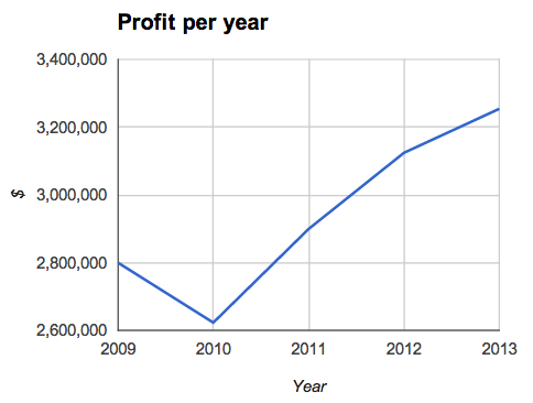
At Bimotics, we recommend that when looking purely at profit over time, a line chart best displays profit trends. A line chart is best suited for analyzing patterns over a time series. It helps you understand historical and current trends, seasonality, and repeatability. It also provides support for comparison while evaluating your data against other variables such as product or service type, sales, store, geography, and customers.
A bar chart can also depict changes in profit over time, however according to Stephen Few, each bar chart should need to start at zero. Take the contrast such as a waterfall chart.
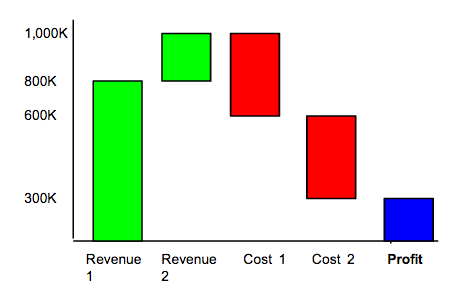
Although the details of revenue and costs are important and can be visualized in the chart above, this chart is confusing, requiring you to figure out its meaning. The chart expects you to do the subtraction of costs from revenue may miss suggest that profit is too small compared to profit.
Returning to the first line chart developed in Bimotics, you can see how choosing the right visualizations allow you to easily and quickly build meaningful comparisons that help you unlock the power of your data. Comparing and forecasting have never been easier for your small and medium sized business.
No comments:
Post a Comment